


A newsletter for modern marketers.

TRUSTED BY THE WORLD'S SMARTEST MARKETERS


Free ad performance benchmarks every week.
Live webinars and strategy sessions with industry leaders.
Watch all previous episodes on our YouTube channel.
Insider strategies from the smartest brands in ecommerce.
SEE LATEST POSTS:
UPT (Units per Transaction) Explained: How to Calculate and Improve Retail Performance

In retail, small increases in basket size can generate meaningful revenue gains without adding new traffic.
UPT, or Units per Transaction, refers to how many items customers purchase in each completed sale. This guide explains what UPT is, how to calculate upt accurately, how it differs from related metrics like average order value, and practical strategies to improve it in stores and online.
Treated correctly, UPT is a powerful and controllable operational lever.
What is UPT in Retail and Why Does It Matter
UPT, or Units per Transaction, measures how many items a customer purchases in a single transaction.
If 100 customers complete purchases and collectively buy 250 items, your UPT is 2.5. In simple terms, it tells you the average basket size in units, not dollars.
UPT is widely used across brick-and-mortar stores, e-commerce sites, and omnichannel retail environments:
- Store managers use it to evaluate associate performance and merchandising effectiveness.
- E-commerce teams use it to assess cross-sell, bundling, and cart optimization strategies.
- In omnichannel environments, UPT helps identify how buying behavior differs between in-store, online, and buy online, pick up in store.
Because it focuses on customers who already decided to buy, improving UPT can increase revenue without increasing traffic or acquisition costs. Instead of finding more shoppers, you help existing buyers purchase just one more item. Over time, those small increases compound into meaningful gains in retail performance metrics.
The Units Per Transaction Formula Explained
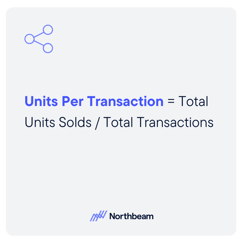
The formula for UPT is: UPT = Total Units Sold ÷ Total Transactions
If you sell 1,200 items across 400 completed purchases, your UPT is 3.0. Meaning that, on average, each transaction includes three items.
“Units” should be clearly defined. A unit typically means an individual sellable item (not a dollar amount). If a customer buys three shirts, that is three units. If you sell bundles or kits, you need a consistent rule. Some retailers count a bundle as one unit because it is sold as a single SKU. Others break it into its component items for internal analysis. The key is consistency.
A “transaction” refers to a completed purchase event. In-store, that means a finalized receipt. Online, it means a confirmed order. Returns complicate the picture: if an item is fully returned, most teams subtract that unit from total units sold in the reporting period. For partial refunds, ensure your system adjusts unit counts accurately.
Common mistakes include mixing gross and net units, failing to account for returns, or inconsistently treating bundles. Clear definitions and standardized reporting prevent inflated or misleading UPT figures.
How UPT Interacts with Other Retail Metrics
UPT does not operate in isolation. It influences, and is influenced by, several other core retail KPIs:
- UPT vs. Average Order Value (AOV): UPT measures how many items are in the basket. While AOV measures how many dollars are in the basket. A retailer can increase AOV by raising prices without changing UPT. Conversely, UPT can rise while AOV stays flat if customers add lower-priced items.
- UPT vs. Conversion Rate: Conversion rate reflects the percentage of visitors who make a purchase. UPT only applies after a purchase occurs. A store may have strong conversion but low UPT, meaning shoppers buy just one item. Optimizing both improves overall revenue efficiency.
- UPT vs. Average Selling Price (ASP): ASP measures the average price per item sold. If ASP drops due to discounting, UPT may rise as customers add more units. However, revenue or margin may not improve proportionally.
Promotions, bundles, and threshold incentives often increase UPT. Price increases may reduce UPT if customers consolidate purchases.
If higher UPT is driven by heavy discounting or low-margin add-ons, gross margin per transaction may decline. Sustainable improvement requires balancing basket size with pricing discipline and margin performance.
How to Increase Units Per Transaction in Stores
Improving UPT in physical retail is largely about influencing behavior at the point of purchase through training, merchandising, and smart incentive design.
Associate Training And Cross-Sell Techniques
Store associates play a direct role in basket size. Training teams to suggest complementary products, ask open-ended questions, and make relevant recommendations can meaningfully increase units per transaction. The goal is not scripted upselling, but helpful guidance that enhances the customer experience.
Product Adjacency And Merchandising Layout
Physical layout shapes buying behavior. Placing complementary products near each other, such as accessories next to core items, increases the likelihood of incremental add-ons. End caps, checkout displays, and curated displays also create natural opportunities to expand baskets.
Bundles And Multi-Buy Promotions
Pre-packaged bundles simplify decision-making and encourage customers to purchase multiple items at once. Multi-buy offers, such as “three for two,” can lift UPT while maintaining perceived value.
Threshold promotions, such as “buy two, save,” can push shoppers to add one more item. However, guardrails are essential. Promotions should protect margin, avoid training customers to wait for discounts, and be measured carefully to ensure long-term profitability.
How to Increase Units Per Transaction in Ecommerce
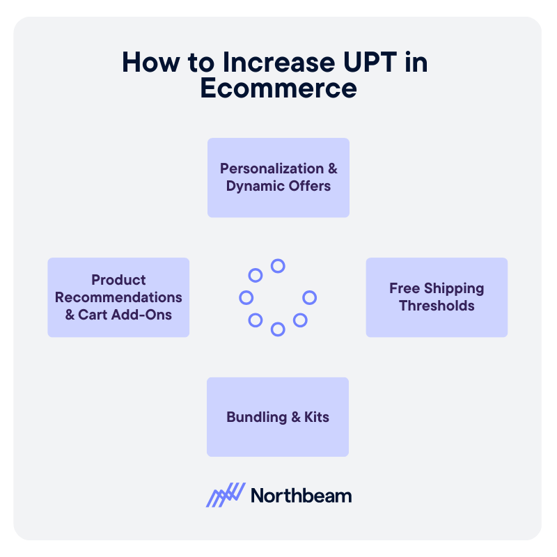
In e-commerce, UPT growth depends on intelligent recommendations, thoughtful incentives, and a frictionless buying experience.
Product Recommendations And Cart Add-Ons
On-site recommendations are one of the most effective digital levers. “Frequently bought together,” “Complete the look,” and in-cart add-on suggestions surface complementary items at moments of high intent. The key is relevance. Irrelevant recommendations reduce trust and lower engagement.
Bundling And Kits
Digital storefronts make it easy to package related products into curated kits. Bundles reduce decision fatigue and increase perceived value while naturally increasing units per transaction. Clear pricing and visible savings strengthen performance.
Free Shipping Thresholds
Shipping thresholds encourage customers to add one more item to qualify for free delivery. When calibrated properly, this tactic lifts UPT without heavy discounting. The threshold should be based on average order value and margin targets.
Personalization And Dynamic Offers
Behavioral data enables personalized recommendations and dynamic cross-sell placements. Returning customers can see tailored suggestions based on browsing or purchase history, increasing basket expansion opportunities.
Too many pop-ups, irrelevant suggestions, or confusing layouts can backfire. UPT strategies should enhance the experience, not interrupt it. Clean design and seamless checkout preserve conversion while encouraging incremental units.
When Not to Push UPT
While increasing UPT can lift revenue, it is not always the right objective. Retail teams must weigh basket growth against margin, customer experience, and long-term loyalty.
Trade-Offs Between UPT And Margin
UPT often rises through discounts, multi-buy offers, or low-priced add-ons. If those incremental units carry thin margins, gross margin per transaction may decline even as basket size grows. A higher UPT that erodes profitability is not sustainable.
Impact On Returns And Customer Satisfaction
Aggressive upselling or forced bundling can increase post-purchase regret. Customers who feel nudged into unnecessary items are more likely to return products, which distorts UPT reporting and increases operational costs.
Long-Term Retention Considerations
Short-term basket expansion should not come at the expense of trust. Retailers that consistently prioritize helpful recommendations over pushy tactics tend to build stronger repeat purchase behavior.
If customers routinely remove recommended add-ons, abandon carts when bundles are required, or show rising return rates, your strategy may be too aggressive.
The most effective UPT strategies enhance value and convenience. When customers perceive recommendations as relevant and beneficial, basket size grows naturally without undermining brand equity.
UPT Measurement & Governance
UPT is most powerful when tracked alongside complementary metrics and governed with clear definitions and discipline.
KPIs To Track Alongside UPT
UPT should never be reviewed in isolation. Pair it with:
- Average Order Value (AOV): Ensures basket size growth translates into revenue.
- Gross Margin Per Transaction: Confirms incremental units are profitable.
- Conversion Rate: Identifies whether basket expansion efforts harm purchase likelihood.
- Return Rate: Flags whether added units lead to post-purchase regret.
- Revenue Per Visitor: Connects traffic, conversion, price, and UPT into one efficiency metric.
Together, these metrics show whether UPT growth is healthy or masking underlying issues.
Diagnostic Checks
Regular analysis helps isolate what is driving change:
- UPT by store, channel, and category
- UPT before and after promotions
- UPT trends across customer segments
Segmenting results prevents broad conclusions based on isolated wins.
Governance Considerations
Strong governance protects data integrity and margin:
- Maintain consistent unit definitions across channels
- Establish a clear reporting cadence
- Implement promotion approval guardrails
Clear ownership and standardized reporting ensure UPT becomes a strategic lever, not a vanity metric.
UPT Implementation Plan
Improving UPT requires structured execution, not isolated tactics. A phased approach ensures sustainable results.
Phase 1: Establish Baseline UPT
Begin by calculating current UPT across stores, channels, and key categories. Break results down by time period and customer segment to identify variability. This baseline creates benchmarks and highlights where performance is strongest or weakest.
Phase 2: Identify High-Impact Opportunities
Analyze where incremental gains are most realistic. For stores, this may include associate training or merchandising adjustments. For e-commerce, it may involve cart recommendations or free shipping thresholds. Prioritize initiatives based on potential lift, margin impact, and ease of execution.
Phase 3: Test And Measure Initiatives
Pilot changes in controlled environments. Test new cross-sell scripts in select stores or adjust recommendation placements on a subset of traffic. Measure UPT alongside AOV, margin per transaction, conversion rate, and return rate to ensure improvements are balanced.
Phase 4: Scale And Standardize
If results are positive and sustainable, roll out initiatives more broadly. Document best practices, align incentives, and maintain consistent reporting. Continuous monitoring ensures UPT growth remains profitable and aligned with brand strategy.
Turning Basket Size Into Sustainable Growth
UPT measures basket size and directly influences retail revenue efficiency. When customers add even one more item per transaction, the impact compounds across stores, channels, and time.
Accurate calculation requires consistent definitions of units and transactions. Without disciplined measurement, UPT can easily be overstated or misunderstood.
Sustainable UPT growth also depends on thoughtful merchandising, effective associate training, and seamless experience design. It works best when optimized alongside margin, conversion rate, and retention, ensuring that basket expansion strengthens profitability and long-term customer trust rather than eroding it.
Data Mapping Demystified: How to Connect and Visualize Your Data Sources
Most data problems do not begin in dashboards, but in the logic that connects one system to another.
Data mapping is critical because it defines how fields align, how definitions are interpreted, and whether numbers can be trusted across tools. When mappings are unclear or inconsistent, even the most sophisticated reporting becomes unreliable.
In this guide, we will explain what data mapping is and why it underpins accurate measurement. We’ll share practical data mapping examples for marketing data and outline a structured approach to implementing and maintaining it over time.
The goal is for you to be able to treat data mapping as a repeatable discipline that keeps your data aligned as your systems, tools, and teams evolve.
What Data Mapping Is And Why It Matters
Data mapping is the process of defining how fields from one system connect to fields in another. It answers practical questions like: Which source field populates this destination field? What format should it be in? Should it be transformed, normalized, or combined with other values?
In simple terms, data mapping creates the blueprint that allows systems to agree on what data means and how it moves.
Data mapping is not the same as ETL (Extract, Transform, Load) or reporting.
- ETL moves and transforms data.
- Reporting visualizes it.
- Data mapping sits upstream of both, defining the logic that makes those processes reliable.
If the mapping is wrong, the pipeline may run perfectly and the dashboard may look polished, but the numbers will still be misleading.
And mapping errors do cascade. A mismatched identifier can break attribution; an inconsistent definition of revenue can distort performance reporting; a missing normalization rule can inflate counts across systems.
When mapping is ignored early, downstream trust erodes, and teams spend more time debugging than deciding.
Data Mapping Best Practices and Examples
A reliable data mapping process starts with structure and clarity. Each component builds on the next, ensuring that data moves accurately, consistently, and in a way that supports downstream reporting and decision-making.
Source Systems and Ownership
Every mapping begins with clearly defined source systems. This includes marketing platforms, CRM, product databases, finance tools, and any system contributing data.
Just as important is ownership. Each source should have a responsible team or individual who understands how the data is generated, maintained, and changed. Without ownership, inconsistencies and silent schema changes go unnoticed.
Fields, Formats, and Data Types
Mapping requires field-level precision. Teams must define exact field names, formats, and data types. Is a date stored as a timestamp or string? Is revenue recorded in cents or dollars? Small mismatches in format or type can create large downstream discrepancies.
Transformation and Normalization Rules
Not all data can be copied directly from source to destination. Transformation rules define how values are cleaned, standardized, combined, or filtered. Normalization ensures consistency across systems, such as aligning country codes, campaign naming conventions, or currency formats.
Destination Schema and Definitions
The destination schema defines how data should look once integrated. Clear definitions for metrics, dimensions, and relationships prevent ambiguity. A shared understanding of what each field represents reduces reporting disputes later.
Documentation and Version Control
Data mappings should be documented and treated as living artifacts. Version control ensures changes are tracked, reviewed, and communicated, preventing unexpected breaks in reporting.
How to Visualize Data Mappings Clearly
Clear visualization turns data mapping from a technical artifact into a shared reference. The right format helps teams understand how data flows, where transformations occur, and how systems connect.
Here are a few best practices to keep in mind:
How to Create a Data Mapping Diagram: Tables, Flowcharts, Entity Relationships
Different visualization types serve different purposes:
- Tabular mapping is ideal for field-level detail, showing source fields, destination fields, data types, and transformation rules in a structured format.
- Flowcharts help illustrate how data moves between systems, making dependencies and handoffs visible.
- Entity relationship diagrams clarify how tables connect through keys and identifiers, which is especially useful in warehouse environments.
When to Use Visual vs Tabular Formats
Tables are best for precision and documentation, while diagrams are better for communication and alignment. Early planning conversations often benefit from visual flow diagrams, while implementation requires detailed mapping tables. Mature teams typically maintain both.
Keeping Mappings Readable as Systems Scale
As data integration mapping expands, mappings can become dense and difficult to interpret. Group related fields, separate logical domains, and avoid overcrowded diagrams. Modular documentation keeps complexity manageable.
Naming Conventions and Annotations
Consistent naming conventions reduce ambiguity. Annotations should explain transformations, exceptions, and assumptions. Clear labeling prevents future confusion when systems evolve.
Making Mappings Usable for Non-Technical Teams
Visualization should not exclude business stakeholders. Simplified diagrams, plain-language definitions, and contextual notes help non-technical teams understand how data supports reporting and decisions.
Common Data Mapping Challenges and How to Solve Them
Even well-designed mappings can break down over time. Most failures are not technical at their core; they stem from unclear definitions, shifting systems, or over-engineered logic.
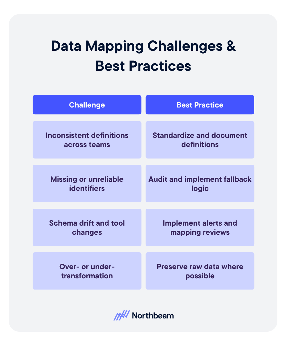
Inconsistent Definitions Across Teams
Problem:
- Marketing defines revenue one way. Finance defines it another. Product tracks users differently than CRM tracks contacts.
- When teams operate with conflicting definitions, mapped fields may technically connect, but the meaning behind them diverges.
- This creates reporting discrepancies and ongoing reconciliation debates.
Solution:
- Establish standardized definitions and document them in a shared field dictionary.
- Align stakeholders before implementation, not after discrepancies appear.
- Governance reviews should include semantic validation, not just technical checks.
Missing or Unreliable Identifiers
Problem:
- Mappings depend on stable keys.
- If identifiers such as user IDs, order IDs, or campaign names are missing, inconsistent, or overwritten, joins fail and attribution breaks.
Solution:
- Prioritize durable identifiers early.
- Where gaps exist, implement fallback logic and enforce naming conventions.
- Audit identifier completeness regularly to prevent silent data fragmentation.
Schema Drift and Tool Changes
Problem:
- Vendors update APIs, fields are renamed, and new properties are added.
- Without monitoring, mappings degrade quietly, leading to incomplete or incorrect data downstream.
Solution:
- Implement schema change alerts and periodic mapping reviews.
- Treat integrations as living systems that require maintenance, not static infrastructure.
Over- or Under-Transformation
Problem:
- Too little transformation leaves inconsistencies unresolved.
- Too much transformation obscures source truth and complicates debugging.
Solution
- Apply only the transformations required for downstream use cases.
- Preserve raw data where possible, and document every rule clearly.
Data Mapping KPIs to Measure
Strong data mapping does not just improve integration accuracy, it also improves measurable operational outcomes. When mappings are well designed and actively maintained, teams spend less time debugging and more time making decisions.
Core KPIs influenced by effective data mapping include:
- Data completeness and freshness: Are expected fields populated, and are datasets updating on schedule?
- Error and reconciliation rates: How often do reports require manual correction or adjustment?
- Reporting consistency across systems: Do marketing, finance, and product dashboards align on shared metrics?
- Time-to-diagnosis for data issues: How quickly can teams trace discrepancies back to a specific field or transformation rule?
Monitoring these indicators helps detect mapping weaknesses early. Beyond KPIs, teams should implement regular diagnostic checks, such as:
- Field-level reconciliation samples to confirm values match across source and destination systems.
- Schema change impact reviews when APIs or tools update.
- Downstream report variance checks to identify unexpected swings caused by structural changes.
Mapping quality rarely fails loudly. Usually, it degrades quietly. Proactive measurement ensures small inconsistencies do not evolve into systemic reporting distrust.
Data Mapping Governance Considerations
Data mapping is not a one-time technical task; it requires ongoing governance to remain reliable as systems evolve and teams grow. Without structure and accountability, even well-designed mappings degrade over time.
Governance considerations should include:
Clear Ownership Per Data Domain
Every data source and destination should have a defined owner responsible for accuracy, changes, and documentation. Ownership ensures someone is accountable when discrepancies arise and prevents silent updates from breaking integrations.
Change Approval and Documentation Standards
Schema changes, new fields, and transformation updates should follow a documented review process. Version control and change logs help teams understand what changed, why it changed, and how it affects downstream reporting.
Regular Audits and Refresh Cycles
Periodic audits validate that mappings still align with business definitions and system configurations. Refresh cycles allow teams to clean up deprecated fields, adjust logic, and ensure the mapping framework continues to support evolving reporting needs.
Governance transforms mapping from a fragile setup into durable infrastructure.
Example Data Mapping Workflow
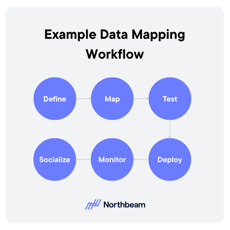
A strong data mapping workflow is iterative and collaborative. It moves from definition to deployment, then continues through monitoring and refinement.
1. Define
Start by clarifying the use case and downstream requirements. What reports, dashboards, or models will depend on this mapping?
Identify source systems, required fields, definitions, and ownership. Clear scope prevents unnecessary transformations and keeps the mapping aligned with business needs.
2. Map
Document how each source field connects to the destination schema. Define transformation rules, normalization logic, and key relationships.
This step should produce a structured mapping artifact, such as a field-level table or diagram, that can be reviewed by stakeholders.
3. Test
Validate mappings before full deployment. Run reconciliation checks, confirm identifier integrity, and compare sample records across systems. Testing ensures that technical accuracy aligns with business definitions.
4. Deploy
Move the mapping into production pipelines or sync jobs. Ensure version control and documentation are updated to reflect the deployed configuration.
5. Monitor
After deployment, monitor data freshness, completeness, and report consistency. Investigate anomalies quickly to prevent silent degradation.
6. Socialize
Effective mapping requires coordination across analytics, engineering, operations, and business teams. Shared visibility and structured review cycles reduce friction and build trust in the resulting data.
From Integration to Insight
Data mapping tools and workflows determine whether systems align or quietly contradict each other. When mappings are thoughtfully designed and clearly documented, data moves with context and consistency instead of ambiguity.
Visual examples and structured artifacts make the logic understandable across technical and non-technical teams. Just as important, governance keeps mappings from degrading over time. Ownership, reviews, and validation routines ensure small changes do not turn into systemic reporting errors.
Strong data mapping is not just an integration task, but the very foundation for trustworthy measurement, reliable attribution, and confident decision-making.

How to Calculate CPM: Formula, Examples, and a CPM Calculator
CPM is one of the most widely used advertising metrics, yet many marketers either calculate it incorrectly or interpret it in isolation.
CPM, or cost per thousand impressions, measures the price you pay for exposure, not actual performance.
In this guide, we’ll break down the CPM formula step by step, walk through practical calculation examples, highlight common mistakes, compare CPM across channels, and show how to use a CPM calculator effectively.
Though not a performance verdict, when used properly, CPM is a powerful pricing and efficiency signal.
What Is CPM and Why Does it Matter
CPM stands for cost per mille, with mille meaning one thousand. In advertising, CPM measures how much you pay for 1,000 impressions. An impression in this context is simply a single ad view. The formula standardizes pricing across campaigns of different sizes, making it easier to compare exposure costs.
CPM is most commonly used in display advertising, paid social, video campaigns, and programmatic media buying. These channels are often optimized around reach and visibility, especially in top-of-funnel campaigns where the goal is awareness rather than immediate conversion.
Buying on CPM differs from buying on CPC, cost per click, or CPA, cost per acquisition. With CPC and CPA, you pay for actions. With CPM, you pay for exposure, regardless of whether someone clicks or converts.
That distinction matters. CPM is a pricing metric, not a performance metric. It tells you how expensive attention is, not how valuable that attention becomes.
CPM is the right metric to focus on when your objective is reach, brand awareness, audience testing, or forecasting budget requirements. It becomes less useful when evaluating efficiency deeper in the funnel, where engagement and revenue matter more than impressions alone.
The CPM Formula Explained Step by Step

The core CPM formula is: CPM = (Total Cost ÷ Total Impressions) × 1,000
Example: If you spend $500 and get 80,000 impressions, CPM = (500 ÷ 80,000) × 1,000 = $6.25.
Here’s what each piece means:
- Total Cost: What you spent to run the ads. Use actual spend for the time period you are analyzing (not the planned budget).
- Total Impressions: The number of times your ad was served and recorded as an impression by the platform.
- × 1,000: Converts the cost per single impression into cost per thousand impressions.
Best practices:
- If you are working with partial campaign data, keep the inputs aligned. For example, if you are looking at the first 7 days of a 30-day campaign, use spend and impressions from those same 7 days only. Mixing full budget with partial delivery is an easy way to get nonsense CPMs.
- For blended campaigns across channels, calculate CPM per advertising channel first, then compute a blended CPM using total spend and total impressions across all included channels. Avoid averaging CPMs directly; that can overweight small campaigns.
Common mistakes include:
- Using clicks instead of impressions
- Mixing currencies
- Mixing time windows
- Rounding errors
Practical CPM Examples Across Channels
CPM varies widely by channel, audience, and objective, so context matters more than the raw number.
Display Advertising Example
A brand runs banner ads on a news site, spending $2,000 for 400,000 impressions. CPM = (2,000 ÷ 400,000) × 1,000 = $5.00.
Display campaigns often have lower CPMs because inventory is abundant and reach is broad. A $5 CPM may be efficient for awareness, but it says nothing about engagement quality or conversion performance.
Paid Social Example
A paid social campaign spends $1,500 and delivers 120,000 impressions. CPM = (1,500 ÷ 120,000) × 1,000 = $12.50.
Social CPMs are typically higher than standard display because of tighter audience targeting and auction dynamics. A higher CPM here may reflect better segmentation rather than inefficiency.
Video Campaign Example
A video campaign spends $3,000 for 150,000 impressions. CPM = (3,000 ÷ 150,000) × 1,000 = $20.00.
Video inventory often commands higher CPMs due to format, attention time, and placement quality.
Blended Channel Example
If total spend across channels is $6,500 and total impressions are 670,000, blended CPM = (6,500 ÷ 670,000) × 1,000 ≈ $9.70.
Avoid averaging channel CPMs directly. Always recompute using total spend and total impressions.
Interpreting High vs Low CPM
A low CPM can signal cheap reach, but not necessarily effective reach. A higher CPM may indicate premium placements, narrower targeting, or stronger audience intent.
The question is not whether CPM is high or low. It is whether it aligns with your campaign objective and downstream performance.
What CPM Does Not Tell You
CPM is useful for understanding exposure costs, but it leaves out critical performance context.
CPM vs Engagement Quality
A low CPM does not mean people are paying attention. You can buy millions of impressions cheaply, but if users scroll past instantly, the value of that exposure is limited. CPM measures delivery, not attention depth or interaction quality.
CPM vs Conversion Rate
CPM does not reflect whether impressions lead to clicks, sign-ups, or purchases. Two campaigns can have identical CPMs but dramatically different conversion rates. Without downstream metrics, CPM alone cannot tell you which campaign is actually working.
CPM Inflation Due to Audience Narrowing
As you narrow targeting, CPM often rises. Smaller audiences increase auction competition and reduce available inventory. A higher CPM in this case may reflect precision, not inefficiency.
Vanity Efficiency Traps
Optimizing solely for the lowest CPM can create misleading wins. Cheap impressions can come from low-quality placements or poorly matched audiences. The metric may look efficient while business outcomes decline.
When to Prioritize Downstream Metrics Instead
When your objective is leads, revenue, or return on ad spend, metrics like cost per acquisition, conversion rate, and revenue per thousand impressions should carry more weight. CPM belongs at the top of the funnel, not as the final measure of success.
How to Use CPM in Strategic Planning
CPM becomes most valuable when used as a forecasting and planning input, not just a reporting metric.
Budget Forecasting Using CPM
Because CPM standardizes cost per 1,000 impressions, it allows you to reverse engineer budget requirements.
If your historical CPM is $10 and you want 1 million impressions, you can estimate spend at roughly $10,000. This makes CPM a practical starting point for media planning conversations.
Estimating Reach Based on Projected CPM
You can also work backward from budget. If you have $25,000 to spend and expect a $12 CPM, projected impressions = (25,000 ÷ 12) × 1,000 ≈ 2.08 million impressions. This helps set realistic expectations for reach before campaigns launch.
Comparing Channel Cost Structures
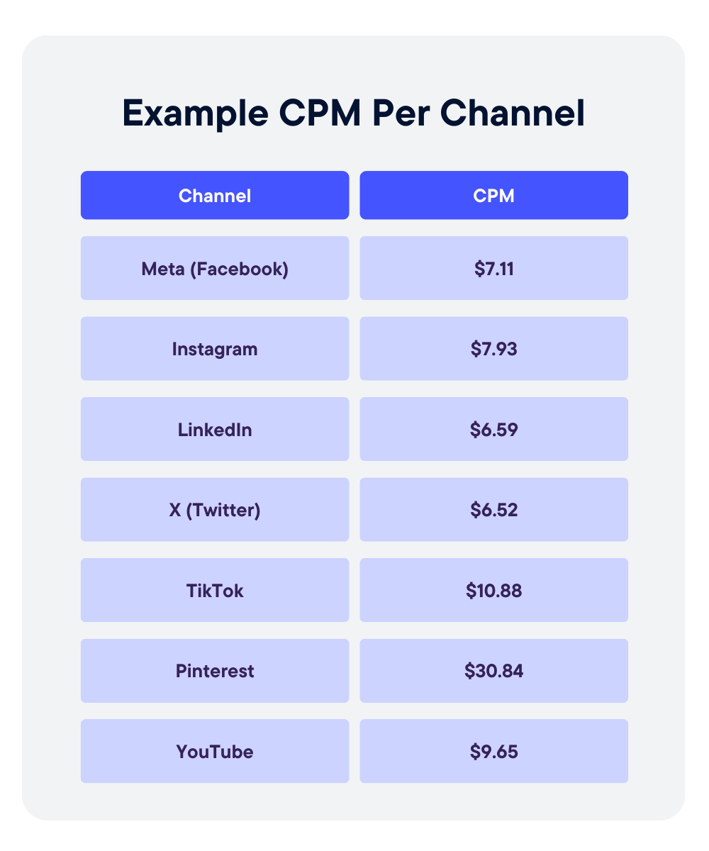
CPM allows apples-to-apples comparison across channels. Display may average $5 to $8, paid social $10 to $15, and premium video $20 or higher. These differences reflect format, targeting precision, and auction dynamics. Comparing CPMs helps clarify where exposure is most affordable.
Monitoring CPM Volatility Over Time
CPMs fluctuate due to seasonality, competition, creative fatigue, and audience saturation. Tracking CPM trends by week or month helps identify inflation, inventory pressure, or performance shifts that require adjustment.
Aligning CPM Targets With Campaign Objectives
Not every campaign needs the lowest possible CPM. Awareness campaigns may prioritize scale, while highly targeted campaigns may accept higher CPMs in exchange for relevance. Strategic planning means setting CPM expectations that match the objective, not optimizing blindly for the cheapest impressions.
CPM Measurement & Governance
CPM should never live alone on a dashboard. To use it responsibly, you need supporting metrics, diagnostic checks, and clear reporting standards.
KPIs to Monitor Alongside CPM
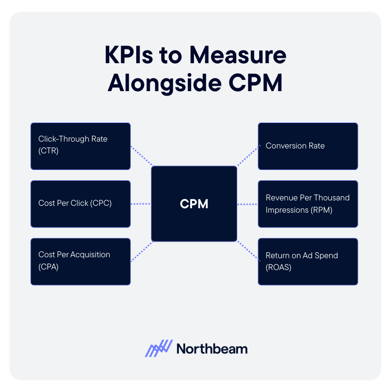
- Click-Through Rate (CTR): Helps determine whether impressions are driving engagement.
- Cost Per Click (CPC): Reveals whether a low CPM is translating into efficient traffic.
- Cost Per Acquisition (CPA): Connects exposure costs to actual business outcomes.
- Conversion Rate: Shows whether traffic generated from impressions is high quality.
- Revenue Per Thousand Impressions (RPM): Adds a monetization layer, helping assess whether impressions are generating proportional value.
- Return on Ad Spend (ROAS): Ensures exposure cost aligns with revenue return.
Diagnostic Checks
- CPM Trends by Audience Segment: Identify whether certain segments are inflating costs or becoming saturated.
- CPM Changes After Creative Updates: Monitor how new creative impacts auction dynamics and delivery efficiency.
- Frequency vs CPM Interaction: High frequency can drive CPM increases and audience fatigue.
Governance Considerations
- Clear Definitions of Impressions: Ensure all platforms use consistent standards for counting impressions.
- Consistent Reporting Windows: Align date ranges across channels before comparing CPM.
- Avoid CPM Optimization Without Downstream Validation: Lowering CPM should not come at the expense of engagement, conversion, or revenue performance.
CPM Implementation Plan
Implementing CPM effectively requires more than plugging numbers into a dashboard. It requires structure, alignment, and ongoing validation.
Step 1: Baseline Current CPMs
Start by documenting historical CPMs by channel, campaign type, and audience segment. Establish realistic benchmarks using at least one to three months of data. This creates a reference point for evaluating future performance.
Step 2: Audit Calculation Consistency
Verify that CPM is being calculated the same way across teams and tools. Confirm that total spend and total impressions align by date range, currency, and platform definition. Eliminate manual spreadsheet formulas that introduce inconsistencies.
Step 3: Integrate CPM Into Planning Model
Incorporate CPM assumptions into budget forecasting and scenario planning. Use expected CPM ranges to project reach and spend requirements. Ensure growth, finance, and media teams are aligned on these assumptions before campaigns launch.
Step 4: Ongoing Optimization and Guardrails
Monitor CPM trends regularly, but avoid optimizing it in isolation. Pair CPM with CTR, CPA, and revenue metrics to ensure efficiency gains do not undermine performance. Revisit benchmarks quarterly to account for seasonality, competition, and market shifts.
CPM Is a Planning Tool, Not a Performance Verdict
CPM measures the cost of exposure, not the value of outcomes. It tells you how expensive attention is, but not whether that attention converts.
Accurate CPM calculation depends on consistent definitions, aligned reporting windows, and clean inputs. Even small inconsistencies in impressions or spend can distort comparisons across channels. Most importantly, CPM should always be evaluated alongside downstream performance metrics like CTR, CPA, and revenue per thousand impressions.
When used in context, CPM becomes a powerful planning input. It supports smarter budgeting, clearer forecasting, and more disciplined media decisions, without pretending to be a final measure of success.


Product

RESOURCES
Support
Legal
Follow us
.svg)
