


A newsletter for modern marketers.

TRUSTED BY THE WORLD'S SMARTEST MARKETERS


Free ad performance benchmarks every week.
Live webinars and strategy sessions with industry leaders.
Watch all previous episodes on our YouTube channel.
Insider strategies from the smartest brands in ecommerce.
SEE LATEST POSTS:
Planning Q1–Q2 2026: Lessons from Last Year's Performance Patterns

Planning Q1–Q2 2026: Lessons from Last Year's Performance Patterns
How to Pace Q1–Q2 2026 Using Median Month-by-Month and Industry Data
As teams pace spend across Q1 and Q2 2026, most are watching a mix of signals: revenue trends, CAC stability, contribution margin, and how first-time performance is tracking relative to plan. The median data from 2025 suggests those mixed signals are not unusual in early Q1. Revenue growth in January and February did not consistently align with improvement in first-time revenue or first-time MER.
Now, with January and February 2026 data in hand, we can place those months directly against their 2025 counterparts. The picture is more encouraging on revenue. The structural tension in new-customer economics persists.
Early Q1 at the Median: 2025 Set a Low Bar

In January 2025, the median business grew revenue 4.33 percent year over year. But beneath that:
- First-time revenue declined 1.57 percent
- First-time MER fell 6.24 percent
- First-time CAC increased 6.58 percent
February 2025 was worse. Median revenue grew just 2.06 percent while first-time MER fell 9.91 percent and new CAC rose 12.20 percent. It was one of the most compressed acquisition months in the full-year dataset.
January and February 2026: Better Revenue, Same Structural Gap
The topline improvement in early 2026 is real and meaningful.
What improved: Revenue accelerated sharply. February 2026 at +9.05 percent versus +2.06 percent a year earlier is nearly a 7-point gap. New revenue flipped positive in both months. First-time MER narrowed by 5.5 points in February versus the prior year.
What has not resolved: New CAC kept rising year over year. New MER stayed negative in both months. The gap between topline and acquisition efficiency has narrowed, but it has not closed.
"Early Q1 2026 is tracking ahead of 2025 on every revenue measure. But the structural pattern holds: new-customer economics remain under pressure in January and February regardless of the topline environment."
The 2025 Spring Inflection: What Actually Happened
January and February 2025 were the two worst months of the year for first-time MER. Then something shifted.
In March, median first-time revenue turned positive for the first time. By May and June, the picture looked different:
- May: revenue +6.82%, new revenue +3.95%, new MER -5.19%
- June: revenue +8.84%, new revenue +4.47%, new MER -3.43%
These were the months where the median operator could scale and maintain efficiency simultaneously. That window lasted roughly four months before efficiency began compressing again in the second half.
What Q2 2026 Might Look Like
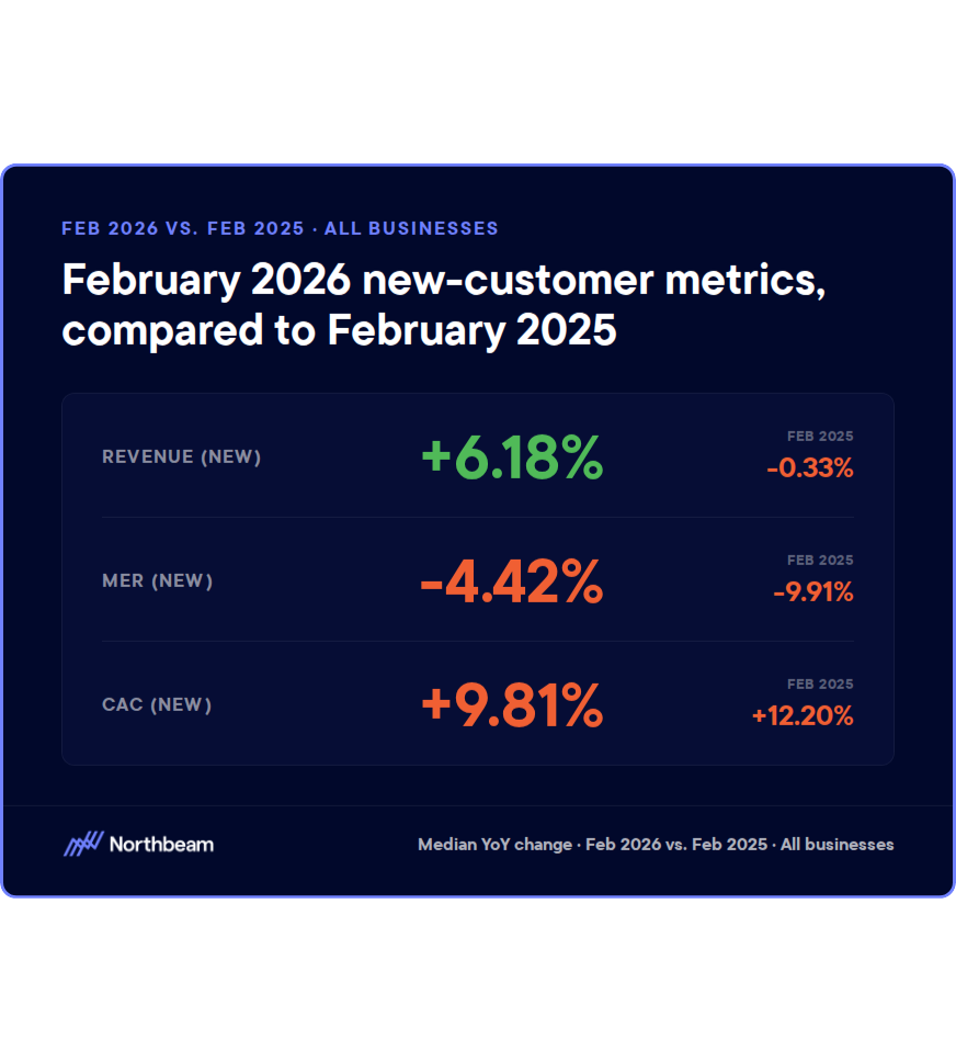
The narrowing first-time MER gap is the most actionable forward signal. In February 2025 new MER was nearly 10 points negative. In February 2026 it was 4.4 points negative. If that trajectory continues into March and April, the spring window for efficient acquisition may begin sooner and scale more cleanly than it did last year.
Two caveats: new CAC is still rising year over year, setting a higher floor for what efficient acquisition costs. And 2025's spring improvement was concentrated and did not persist into the second half. A strong Q2 does not guarantee a strong Q3.
"The spring inflection in 2026 could arrive earlier and reach a higher ceiling than it did last year. But only for brands that built the creative and budget infrastructure to meet it."
For budget pacing specifically:
- Watch March closely as a potential earlier inflection than 2025 provided
- Target April through June as the primary acquisition window
- Set explicit CAC ceilings that account for year-over-year cost inflation
- Ensure creative velocity built in Q1 is ready to support Q2 scale
Industry Windows Worth Knowing
Sporting Goods & Fitness. February through May are the primary acquisition months. Full-year 2025 saw median spend up 25 percent and revenue up 16.66 percent, but new MER fell 11.11 percent. January is for offer and creative prep. The improving early-Q1 backdrop may extend the usable window slightly in 2026.
Health & Wellness. Resolution season can drive January volume, but 2025 showed the window closes fast. Full-year median revenue grew only 4.26 percent despite spend rising 9.42 percent. New-customer growth was almost entirely concentrated in Q1 and Q2. New MER fell sharply from August through December. Caution from Q3 onward is warranted.
Fashion & Accessories. First-time MER was negative in every single month of 2025. Late spring, particularly June (new revenue +9.30 percent median), offered better conditions than early Q1 or late Q4. Early revenue stabilization should not trigger heavy prospecting before the calendar supports it.
Home & Furniture. May and August are historically the cleanest acquisition windows. May 2025 delivered median MER of +5.05 percent. Full-year new CAC rose 9.47 percent. Use Q1 for testing and treat February through April as a controlled-motion period with strict payback targets.
Size Still Determines the Margin for Error
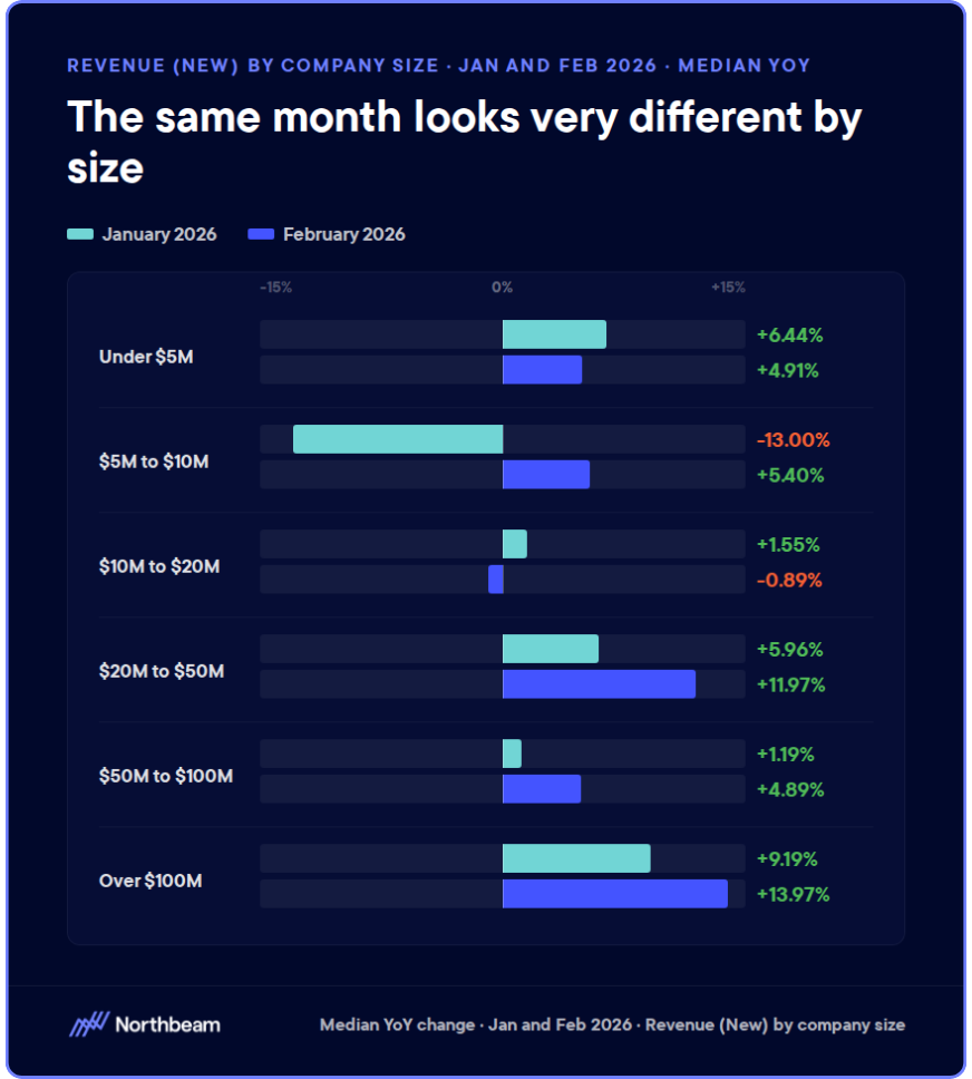
In 2025, sub-$5M businesses saw median revenue decline 1.43 percent despite modest spend increases. The $50M-$100M band grew revenue 15.28 percent. The $100M+ band grew 15.19 percent.
The 2026 aggregate improvements are real, but unevenly distributed. Smaller businesses should not read a strong aggregate headline as license to front-load spend. The improving early-Q1 environment helps larger operators most. For smaller brands, Q1 discipline from 2025 still applies.
The Bottom Line
January and February 2026 are tracking materially ahead of 2025. Topline is stronger. New revenue is positive. The first-time MER gap is narrowing. But the structural compression of early Q1 has not disappeared, and new CAC continues rising year over year.
"The goal is not to under-spend in Q1. It is to recognize that cleaner scaling conditions historically emerge in spring, and to position budget, guardrails, and creative accordingly."
The spring window is shaping up to be stronger than last year. The brands that capture it will be the ones that treated early Q1 as infrastructure rather than acceleration.

Attribution Models 101: From First-Touch to Linear

Attribution models determine how credit is assigned across the buyer journey, shaping budgets, priorities, and decisions.
This guide breaks down the most common attribution models, explains how attribution windows work and affect results, and shows how marketing attribution tools put these ideas into practice.
The verdict: no single model is “correct” in isolation. What matters most is choosing an approach that fits your business and applying it consistently over time.
What Marketing Attribution Is and Why It Matters
Marketing attribution is the practice of assigning credit to the marketing touchpoints that influence a conversion or revenue outcome.
In practical terms, it helps teams answer a simple but high-stakes question: which activities are contributing to results, and how much should each one matter in decision-making?
Attribution exists because modern marketing is a portfolio of bets. Budgets are spread across channels, campaigns, and time, and leaders need a way to allocate spend, prioritize effort, and learn what is actually moving the business forward.
Without attribution, decisions default to intuition, recency bias, or whoever makes the strongest argument in the room.
Attribution should be treated as a decision framework, not a reporting exercise. Its value is not in producing a perfectly accurate chart, but in creating a shared, repeatable way to compare options and test assumptions over time.
This is also where attribution breaks down. Buyer journeys are nonlinear, cross-device, and influenced by factors that are difficult or impossible to track. As a result, attribution provides directional insight, not exact causality.
The goal is not to prove what caused a conversion, but to understand patterns well enough to make better, more confident decisions.
Overview of Common Attribution Models
Attribution models differ in how they distribute credit across the buyer journey. Each model reflects a set of assumptions about what matters most, and those assumptions materially shape how channels and campaigns are valued.
First-Touch
First-touch attribution assigns all credit to the first interaction that introduces a buyer to your brand.
Its strength is clarity. It highlights top-of-funnel discovery and is useful for understanding which channels are effective at generating initial demand.
Its weakness is that it ignores everything that happens after awareness, often overstating the value of early touches while undervaluing nurturing and conversion-driving efforts.
Last-Touch
Last-touch attribution gives full credit to the final interaction before conversion.
It persists because it is simple and aligns neatly with conversion reporting. However, it often misleads by over-crediting lower-funnel channels and underestimating the cumulative influence of earlier marketing activity.
Linear/Multi-Touch
Linear attribution distributes credit evenly across all recorded touchpoints in a multi-touch attribution model.
This model is useful when the goal is to acknowledge the full journey without prioritizing any single stage. The trade-off is that it assumes all touches are equally influential, which is rarely true in practice.
Time-Decay
Time-decay attribution weights interactions closer to conversion more heavily. It reflects momentum and buying intent, making it useful for longer sales cycles. However, it can still minimize the strategic importance of early demand creation.
Position-Based
Position-based attribution emphasizes both entry and conversion points, typically assigning more credit to the first and last touches. This approach balances discovery and closure, but still relies on fixed assumptions about where value is created.
Ultimately, different models can dramatically change perceived channel value. Understanding those shifts is more important than selecting a single “correct” model.
Understanding Attribution Windows and Their Impact
Attribution windows define how far back in time a touchpoint can occur and still receive credit for a conversion. While often treated as a technical setting, window length plays a major role in shaping what attribution surfaces and what it quietly excludes.
Why Attribution Windows Matters
Attribution windows exist to create boundaries. They limit how much historical activity is considered relevant to a conversion, helping teams avoid assigning credit to interactions that are too distant to be meaningfully connected.
Typical Window Lengths by Channel
Paid search and social often use shorter windows, while content, email, and organic channels tend to require longer lookback periods to capture influence over time.
How Window Choice Affects Performance
Short windows favor lower-funnel channels and recent activity. They reduce noise but introduce recency bias.
Longer windows increase the apparent impact of awareness and nurturing efforts, often reshaping channel rankings. They capture more context but risk overstating weak or indirect influence.
How Marketing Attribution Tools Operationalize Models
The best marketing attribution tools translate abstract models into operational systems by collecting data, applying logic, and producing outputs teams can act on. Understanding how this process works helps clarify both the power and the limits of marketing attribution software.
Data Ingestion
Attribution tools ingest data from ad platforms, web analytics, CRM systems, and other sources. These inputs include events, identifiers, and recorded touchpoints that form the raw material for attribution analysis.
Identity Resolution and Cross-Device Challenges
To connect touchpoints into a single journey, tools rely on identity resolution. This process is imperfect, especially across devices, browsers, and anonymous sessions, and directly affects attribution accuracy.
Model Configuration and Customization
Tools allow teams to select attribution models, define windows, and apply weighting rules. These configurations encode assumptions about how value is created across the funnel.
Reporting Outputs
Outputs typically include dashboards, comparisons, and channel-level summaries that can be used to guide actions.
But even the most sophisticated tooling cannot compensate for incomplete inputs, unclear goals, mismatched models, or unrealistic expectations. Tools amplify assumptions; they do not correct them.
Choosing the Right Attribution Model for Your Team
The right attribution approach depends less on sophistication and more on fit. Models and windows should reflect how your funnel actually works, how long decisions take, and how your organization uses insights to make trade-offs.
Funnel complexity and sales cycle length are the first constraints. Short, transactional journeys can often rely on simpler models and tighter windows, while longer, multi-stakeholder sales cycles benefit from approaches that recognize sustained influence over time.
B2B and B2C programs also face different pressures. B2C teams often prioritize speed, volume, and channel efficiency, while B2B teams need attribution that supports account-based motion, longer consideration periods, and collaboration with sales.
These differences should shape both model choice and expectations.
Finally, consider program maturity. Early-stage teams are often better served by stable, easy-to-explain models that establish baselines. As programs mature and data quality improves, more nuanced approaches can add value.
Attribution Approach Decision Checklist
- Which decisions will attribution inform?
- How long is our typical buying cycle?
- How complex are our conversion paths?
- Who needs to trust and use our output?
- How stable is our data and identity resolution?
- How often can models realistically change?
Common Attribution Mistakes and How to Avoid Them
Most attribution failures come from how attribution is interpreted, operationalized, and governed inside an organization.
Treating Attribution as a Source of Truth
Attribution is often mistaken for a definitive answer to what caused a conversion. In reality, it offers directional insight. Treating it as ground truth leads to overconfidence and brittle decisions.
Changing Models Too Frequently
Frequent model changes make trends impossible to interpret. When the rules keep shifting, teams lose the ability to compare performance over time and confidence in the outputs erodes.
Ignoring Non-Digital Touchpoints
Many buyer journeys include offline or non-trackable interactions such as sales conversations, events, referrals, or word of mouth. Ignoring these touchpoints biases attribution toward what is easiest to measure, not what is most influential.
Optimizing Spend Without Guardrails
Attribution-driven optimization without constraints can lead to short-term efficiency at the expense of long-term growth. Channels that build demand or support conversion indirectly are often the first to be cut.
Practical Fixes
Clear documentation, locked model definitions, agreed interpretation rules, and a regular review cadence help keep attribution useful, trusted, and aligned with business outcomes.
Attribution Model Measurement, Tools, & Governance
Attribution only creates value when it is measured against the right outcomes, supported by reliable tooling, and governed with discipline.
Measurement
Attribution should inform a small set of business-relevant indicators, not an ever-expanding list of metrics. The most useful KPIs focus on trends and confidence rather than point-in-time precision.
Key indicators should include channel efficiency trends over time, confidence in budget reallocation decisions, consistency in observed conversion paths, and stability in forecasting.
When attribution outputs fluctuate dramatically without underlying business changes, that volatility is a signal to investigate assumptions rather than react to results.
Tools
Attribution tools operate as layered systems. The data layer ingests inputs from ad platforms, web analytics, and CRM systems. These inputs are then processed through event normalization and identity stitching to create a usable representation of the buyer journey.
At the core sits the attribution engine, where model logic, windowing rules, and weighting are applied. Outputs typically take the form of dashboards, model comparisons, and planning inputs that support budgeting and prioritization.
The goal is clarity and consistency, not exhaustive reporting.
Governance
Strong governance ensures attribution remains trustworthy and actionable. Diagnostic checks such as sensitivity to model changes, window-length impact analysis, and channel overlap or inflation help teams understand how fragile or robust their insights are.
Effective governance also requires locked model definitions on a regular cadence, documented assumptions and limitations, and cross-team agreement on how results should be interpreted and used.
Attribution Model Implementation Plan
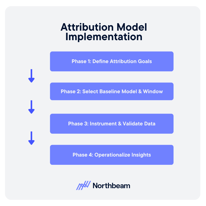
Implementing attribution effectively requires a phased approach that prioritizes clarity, data reliability, and organizational alignment before optimization. Each phase builds on the last, reducing risk while increasing confidence in the decisions attribution supports.
Phase 1: Define Attribution Goals
The first step is defining what attribution is meant to inform. Leadership should align on the decisions attribution will support, such as budget allocation, channel evaluation, or planning scenarios, and document clear success criteria.
Phase 2: Select Baseline Model and Window
Once goals are defined, marketing operations selects a baseline attribution model and window that match funnel structure and buying cycle length. This configuration should be simple, explicit, and stable.
Phase 3: Instrument and Validate Data
Analytics teams ensure events, identifiers, and integrations are correctly instrumented and validated. The focus is on completeness, consistency, and repeatability, not perfection.
Phase 4: Operationalize Insights
In the final phase, attribution insights are embedded into planning, budgeting, and performance reviews. When attribution consistently informs real decisions, it has moved from theory to practice.
Attribution Models as Decision Tools
Attribution models are tools for learning, not final verdicts, and window choice shapes results as much as model choice. In practice, simple and consistent approaches often outperform complex ones. And with strong governance, attribution can become a system for confident decision-making.
Behavioral Segmentation: How to Build Audiences from Actions
What customers say about themselves matters less than what they actually do.
Behavioral segmentation groups users based on real actions, such as purchases, browsing activity, engagement frequency, and product usage, rather than static attributes or stated preferences.
This guide covers what behavioral segmentation is, how it works in practice, and how to build and apply it across channels. When tied to lifecycle strategy and measurement discipline, behavioral segmentation becomes a reliable driver of performance and more efficient growth.
What is Behavioral Segmentation
Behavioral segmentation groups customers based on what they actually do, not what they say about themselves.
Instead of relying on static attributes like age, industry, or job title, it uses observed actions such as purchases, browsing behavior, product usage, and engagement frequency to define audiences.
This differs from demographic segmentation, which focuses on who a customer is, and psychographic segmentation, which focuses on attitudes or preferences. Behavioral segmentation centers instead on real interactions, making it more actionable for marketing and growth teams.
Common behavioral signals include:
- Purchase history
- Pages viewed
- Feature adoption
- Session frequency
- Response to past campaigns
These signals can be tracked across channels and updated continuously as customer behavior changes.
Because behavior reflects intent, it is often more predictive than stated attributes. A user who repeatedly visits a pricing page or abandons a cart shows clearer purchase intent than one who simply fits a target persona.
Core Behavioral Segmentation Models
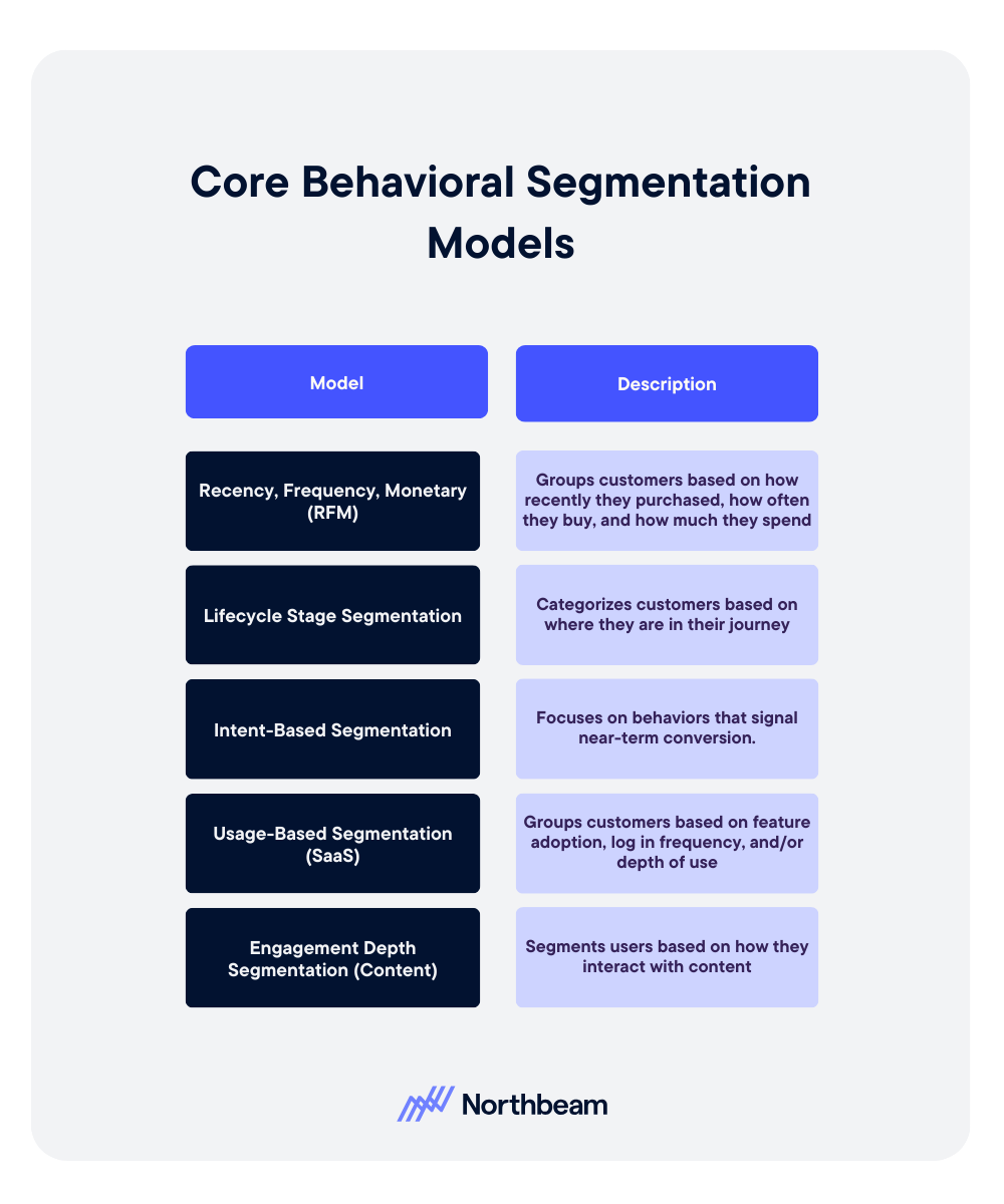
Different behavioral segmentation models organize customer actions in distinct ways. The right model depends on your business type, data availability, and the decisions you are trying to inform.
Recency, Frequency, Monetary (RFM)
RFM segmentation groups customers based on how recently they purchased, how often they buy, and how much they spend. It is widely used in e-commerce and retail to identify high-value customers, reactivation opportunities, and churn risk.
Lifecycle Stage Segmentation
Lifecycle segmentation categorizes customers based on where they are in their journey, such as new users, active customers, at-risk users, or churned accounts. This model helps align messaging and offers to customer maturity, ensuring that communication is timely and relevant.
Intent-Based Segmentation
Intent-based segmentation focuses on behaviors that signal near-term conversion, such as repeated product views, pricing page visits, or trial sign-ups. These segments are often used for performance marketing and sales prioritization, where timing and relevance are critical.
Usage-Based Segmentation (SaaS)
In SaaS environments, segmentation is often based on product usage. Customers can be grouped by feature adoption, login frequency, or depth of use. This helps identify power users, expansion opportunities, and accounts at risk of churn.
Engagement Depth Segmentation (Content)
For content-driven businesses, engagement depth segments users by how they interact with content, such as page views, time on site, or repeat visits. These segments inform personalization, subscription strategies, and audience development.
Behavioral Segmentation Examples & Use Cases Across Channels
Behavioral segmentation becomes most valuable when applied in context. The same underlying signals can be used differently depending on the channel, business model, and customer journey.
Ecommerce Product Recommendation Segments
Retailers commonly segment customers based on browsing and purchase behavior.
- Users who frequently view a category but have not purchased can receive targeted recommendations or limited-time offers.
- Repeat buyers may be grouped into loyalty segments and shown complementary products.
B2B Account Engagement Tiers
In B2B marketing, accounts are often segmented by engagement level.
- High-intent accounts that attend webinars, download resources, and revisit key pages can be prioritized for sales outreach.
- Lower-engagement accounts may remain in nurture campaigns until their activity increases.
SaaS Feature Adoption Cohorts
SaaS companies segment users based on feature usage and product adoption.
- Customers who have adopted core features may be candidates for upsell.
- Those who have not reached activation milestones can receive onboarding support or education campaigns.
Re-Engagement Campaigns for Inactive Users
Inactive users can be grouped by time since last interaction and prior behavior.
- Recently lapsed users may respond to reminders.
- Long-dormant users may require stronger incentives or win-back campaigns.
Cross-Sell Triggers Based on Purchase Behavior
Purchase history can be used to trigger cross-sell opportunities.
- Customers who buy one product category can be targeted with related items, bundles, or upgrades based on observed buying patterns.
How to Build and Use Behavioral Segments
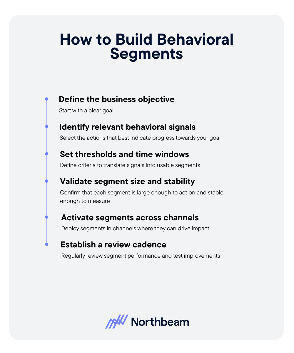
Building effective behavioral segments requires a structured approach that connects customer actions to clear business outcomes.
- Define the business objective first. Start with a clear goal, such as increasing conversion, improving retention, or driving expansion revenue. The objective should determine how segments are designed and how success is measured.
- Identify relevant behavioral signals. Select the actions that best indicate progress toward your goal. This may include purchases, product usage, engagement frequency, or high-intent behaviors like pricing page visits.
- Set thresholds and time windows. Translate signals into usable segments by defining criteria. For example, users who logged in three times in the past seven days, or customers who have not purchased in 60 days. Time windows ensure segments stay relevant.
- Validate segment size and stability. Confirm that each segment is large enough to act on and stable enough to measure. Very small or highly volatile segments can lead to unreliable results and inconsistent performance.
- Activate segments across channels. Deploy segments in the channels where they can drive impact, such as email, paid media, in-app messaging, or sales outreach. Ensure messaging aligns with the behavior that defines the segment.
- Establish a review cadence. Regularly review segment performance, refresh definitions as behavior changes, and test improvements. Behavioral segmentation is not static, it should evolve alongside your customers and business goals.
Measurement and Optimization of Behavioral Segments
Measuring behavioral segments ensures they drive meaningful outcomes, not just cleaner audience definitions. Effective teams track performance, diagnose issues, and continuously refine segments over time.
Core KPIs
Behavioral segments should be evaluated against business outcomes, not just activity.
Key metrics include:
- Conversion rate by segment
- Revenue per user
- Retention rate
- Engagement frequency
Diagnostic Checks
Beyond top-line metrics, diagnostic checks help validate whether segments are working as intended.
- Segment overlap analysis ensures audiences are distinct and not competing with each other.
- Segment decay measures how quickly behaviors become outdated, requiring refresh.
- Comparing performance lift against a non-segmented baseline helps confirm that segmentation is actually improving results.
Common Behavioral Segmentation Mistakes
Even well-designed behavioral segmentation strategies can break down in practice. Most issues come from how segments are defined, maintained, and activated over time.
Creating Too Many Micro-Segments
- Mistake: Over-segmenting audiences into highly specific groups that are too small to act on or measure reliably.
- Fix: Focus on a smaller set of high-impact segments that are large enough to drive meaningful results. Prioritize clarity and actionability over precision.
Using Stale Data
- Mistake: Building segments on outdated behaviors that no longer reflect current customer intent.
- Fix: Use rolling time windows and refresh segments regularly to ensure they reflect recent activity. Prioritize signals that update frequently.
Ignoring Sample Size Limitations
- Mistake: Making decisions based on segments that are too small or volatile, leading to misleading performance insights.
- Fix: Validate that segments meet minimum size thresholds before acting on them. Aggregate similar segments when needed to improve statistical reliability.
Failing to Align Segments With Messaging
- Mistake: Defining segments based on behavior but delivering generic or mismatched messaging that does not reflect that behavior.
- Fix: Ensure that messaging directly corresponds to the action that defines the segment. For example, high-intent users should receive conversion-focused messaging, while early-stage users need education.
Treating Segments as Static
- Mistake: Assuming segments remain valid over time, even as customer behavior changes.
- Fix: Treat segmentation as a dynamic system. Continuously monitor performance, update definitions, and test improvements to keep segments relevant and effective.
Behavioral Segmentation Toolkit
Effective behavioral segmentation depends on the systems that capture, define, and activate customer data across the stack.
Data Sources
Behavioral segmentation starts with reliable data inputs. Common sources include CRM systems, which store customer and transaction data; product analytics platforms, which track feature usage and engagement; and website tracking tools, which capture browsing behavior and on-site interactions.
Segmentation Engine
A segmentation engine translates raw behavioral data into usable audiences. This can include rule-based segmentation, where users are grouped based on defined criteria, or dynamic audiences that update automatically as behavior changes over time.
Activation
Segments create value when they are activated across channels. Common activation points include email campaigns, paid media targeting, and in-app messaging. Aligning segments with the right channels ensures that behavioral insights translate into relevant customer experiences and measurable outcomes.
How to Implement Behavioral Segmentation Strategy
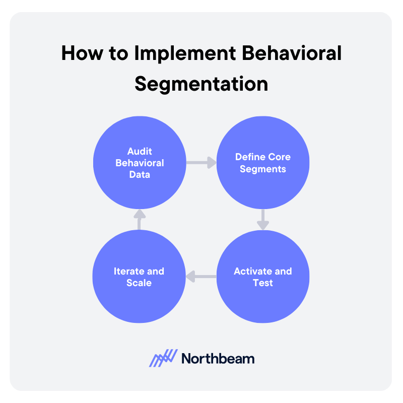
Turning behavioral segmentation into a repeatable system requires coordination across data, marketing, and product teams. A phased approach helps ensure segments are both actionable and measurable.
Audit Behavioral Data
Start by assessing what behavioral data is available and reliable. This includes CRM data, product analytics, website tracking, and campaign engagement signals. Identify gaps, inconsistencies, and areas where tracking needs to be improved. The goal is to build a clear inventory of usable signals.
Define Core Segments
Based on your business objectives, define a small set of core segments that will drive the most impact. These might include high-intent users, new customers, at-risk accounts, or power users. Document the logic, thresholds, and time windows for each segment to ensure consistency.
Activate and Test
Deploy segments across key channels such as email, paid media, in-app messaging, or sales outreach. Pair each segment with tailored messaging that reflects user behavior. Test performance through controlled experiments to validate that segmentation improves outcomes.
Iterate and Scale
Refine segment definitions based on performance data and expand usage across additional channels and teams. As segmentation matures, integrate it more deeply into campaign planning, personalization, and forecasting. Over time, this creates a scalable system that continuously improves with new data and insights.
From Audience Targeting to Actionable Growth
Behavioral segmentation shifts marketing from assumptions to observable action. By grounding audience strategy in what customers actually do, teams can prioritize the signals that matter most and deliver more relevant experiences across the lifecycle.
The most effective segmentation strategies begin with clear objectives, are built on reliable data, and are validated through measurement and experimentation. Without this discipline, segments risk becoming static labels rather than drivers of performance.
When supported by strong governance and continuous iteration, behavioral segmentation becomes a system for aligning data, decision-making, and execution to drive sustainable growth.


Product

RESOURCES
Support
Legal
Follow us
.svg)
